Enhancing Registration, Login, and Guest Checkout for Argos, Habitat, and Tu
Our team embarked on a mission to improve the registration and login experiences on the Argos website, focusing on three major brands: Argos, Habitat, and Tu. Alongside this, we introduced a much-requested guest checkout feature. This project aimed to streamline the user journey, making it easier for both new and returning customers to shop with ease, while ensuring business goals were met.
Date: Q1 2021 - Q1 2022
Lead Product Designer: Alex Dawson

Problem
Our project tackled several key issues:
Customer drop-off during registration: New users were required to create an account, which introduced friction, especially with the removal of the check-and-reserve feature.
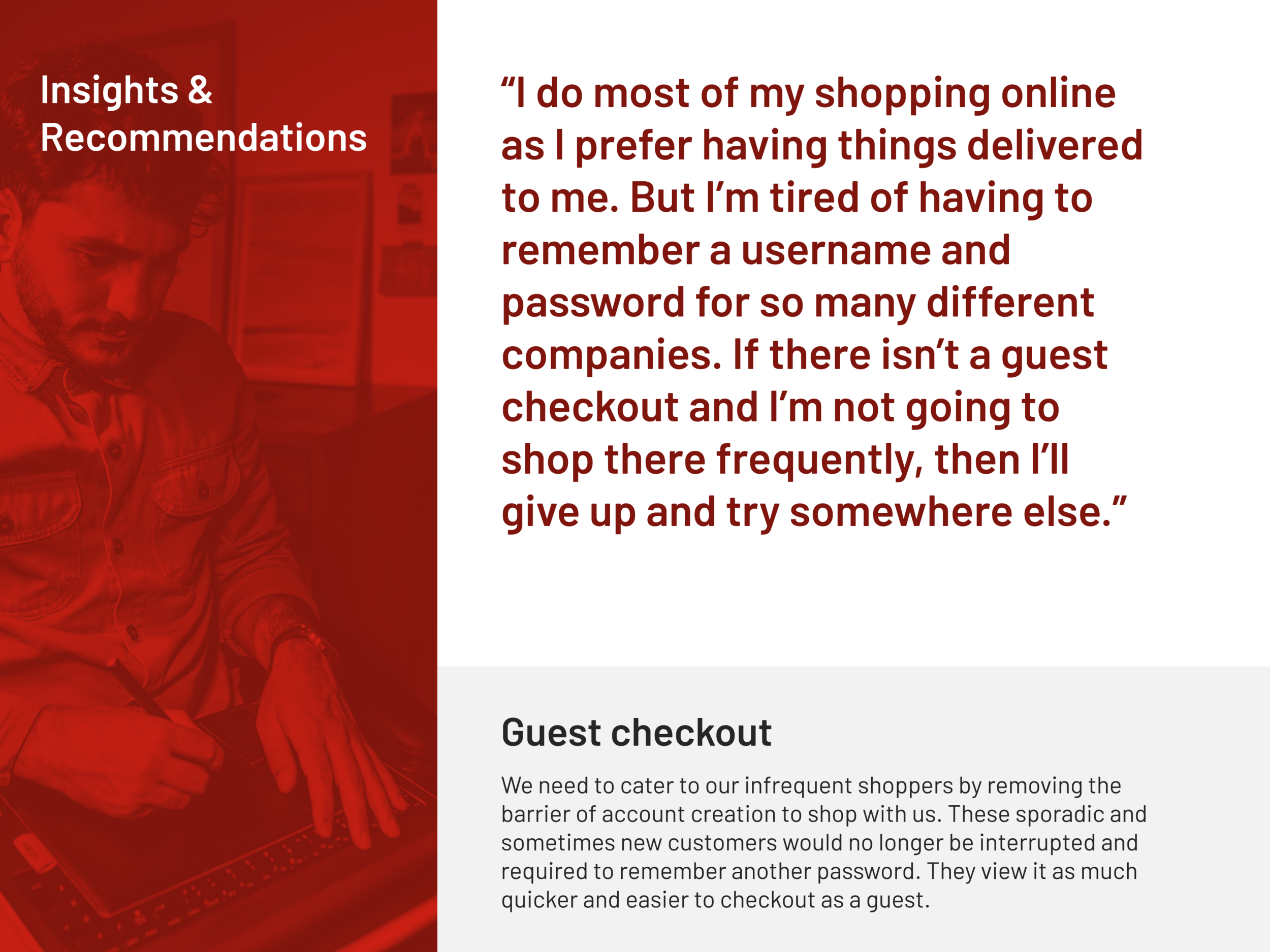
Loss of guest checkout: When Habitat was migrated onto Argos’ platform, the guest checkout feature was removed. Before migrating Tu, the goal was to restore this feature across all platforms.
Account creation as a barrier: Creating an account added time to the checkout process and frustrated customers, particularly infrequent shoppers who preferred a guest checkout option.
Business needs: B2B users and social media-driven sales provided unique challenges. The former didn’t want their customers to self-serve, and the latter would benefit from a quick, frictionless checkout process without the need for account creation.
Users and audience
We knew from research that a large portion of our users regularly use guest checkout on other e-commerce platforms, finding it faster and more convenient. Many are also part of loyalty schemes, but account creation fatigue, security concerns, and the need to remember passwords deter them from creating new accounts for one-off purchases. Understanding these behaviours shaped the development of the guest checkout feature as an essential step forward.
Roles and responsibilities
As a Lead UX Designer, I collaborated closely with another UX Designer, two PMs, and a Tech Lead. Stakeholders from Habitat and Tu, along with our backend teams, were integral in aligning design with business goals.
Scope and constraints
The aim is to have the project implemented by the end of the financial year. Being a quick turnaround for our team, we will be working on the Home Delivery and CAPE implementation in between. We will be releasing the project in phases. First is Pay@browse, then progressive register in checkout followed by guest checkout. Each of these phases will have new features and iterations added to the experience.

Discover
Our team began by mapping the current customer journeys for both registration and login, focusing on the distinct pathways accessed via the header and the trolley pages. This mapping exercise helped reveal areas where customers faced decisions, pain points, and friction. We also conducted a heuristic analysis based on Jakob Nielsen’s ten usability principles, identifying usability gaps and points of friction.
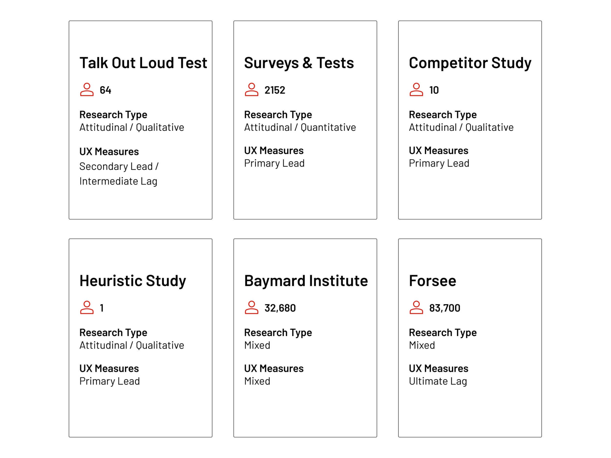
Next, I conducted competitor analysis, reviewing login and checkout processes at John Lewis, H&M, Etsy, and Selfridges. We evaluated how these competitors handled registration, guest checkout, and user engagement, helping us benchmark Argos against the industry standard.
To further support our findings, we tapped into research from the Baymard Institute, known for its detailed e-commerce studies, and collaborated with our in-house end-to-end team for customer feedback gathered through service interactions. This wealth of information set the stage for our first round of usability testing, where I led four separate studies with 22 participants. This provided valuable insights into how users navigated our registration and sign-in flows, pinpointing areas of confusion or frustration.


Define
From the discovery, we identified key insights:
Guest checkout was a critical feature, particularly for infrequent customers, but it presented trade-offs, such as the inability to leverage user data for marketing or personalization.
Account creation friction led to the abandonment of checkout, especially among first-time shoppers wary of sharing personal information.
We also identified usability issues like unclear form headings, redundant data entry (e.g., re-typing passwords), accessibility concerns (e.g., contrast and button sizes), and the mandatory collection of titles, which alienated some users.
With these insights, we defined several key metrics for the project:
Conversion rate increases for both logged-in and guest users.
Decreased exit rates during the sign-in and checkout process.
Reduced time spent on checkout (both for account holders and guest users).
Customer satisfaction (CSAT) scores and other factors like Nectar usage and order fraud rates.


Develop
Armed with clear user insights, we moved into ideation. Leveraging our existing design system, we quickly jumped into high-fidelity prototypes. The registration, login, and guest checkout screens went through eight variations, each tested for user feedback and interaction metrics. We compared these versions through key performance indicators such as time on task, ease of use, and click counts across both desktop and mobile devices.
One of our primary design decisions involved testing the placement of the guest checkout option. We experimented with placing it on the order success page and as part of the checkout flow. Another key test involved varying the layout of order summaries during checkout—comparing right-hand vs. header placements to see which one offered the clearest, least disruptive experience.
As the winning design emerged from these tests, we moved forward with end-to-end research, using UserZoom to evaluate the new designs across all possible paths—from product page to order completion, for both delivery and in-store collection.


Deliver
After finalizing the design, we conducted several rounds of user testing, including 64 talk-out-loud sessions and 2,152 unmoderated surveys. Through these tests, we iterated on the micro-copy and interaction details, fine-tuning the experience to address user concerns, such as why certain data was being collected (e.g., phone numbers) and how secure their information was.
One of the biggest challenges was the backend limitations we faced. While we couldn’t change the database structure in our first release, we used UI design to mitigate some of the problems, like clarifying why titles were required and making data confirmation simpler for users.
By the end of the project, we had developed a fully responsive web solution that worked across six breakpoints for Argos, Habitat, and Tu, as well as for in-store Pay@Browse terminals.
Outcomes & Lessons
We expect to launch the new experience by Q1 2022, achieving a seamless registration, login, and guest checkout journey for all customers. This will enhance user satisfaction, reduce cart abandonment, and help us meet our business objectives.
Key Learnings:
One of the biggest takeaways was realizing how our marketing preferences were presented during registration. This often confused customers and led to drop-offs. Another learning was the cluttered nature of our order confirmation page, which customers found overwhelming. This is an area for future refinement.
This project reinforced the importance of addressing customer needs early in the journey, providing a clear, accessible, and flexible experience that empowers users—whether they’re loyal customers or first-time visitors.


